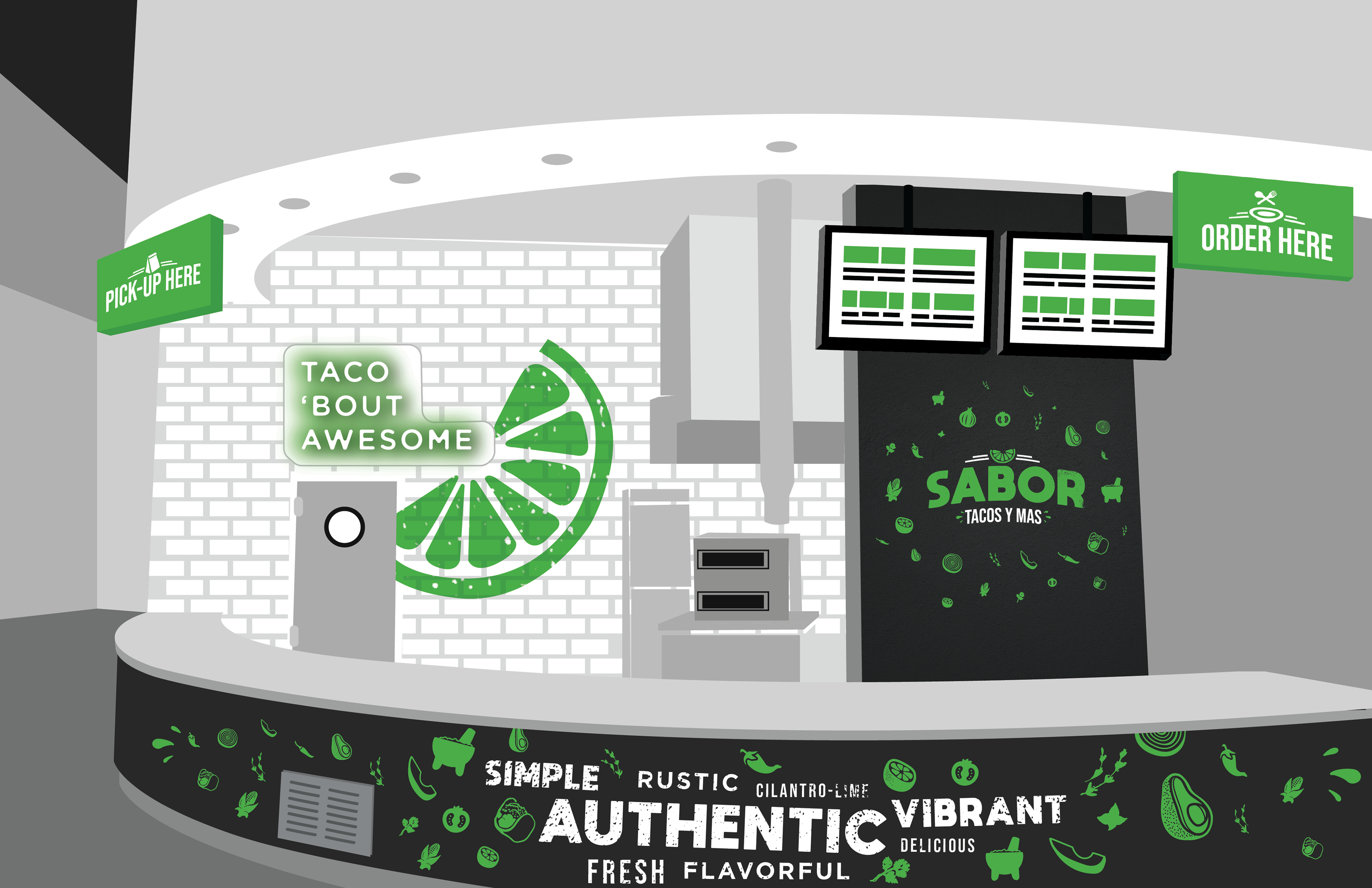
At the University of Texas, we were tired of the bland, underwhelming concepts that were being provided by our department as in-house retail dining locations on campus. For the next concept, we wanted something fresh, vibrant, and energetic, based on a simple concept: Street Tacos.
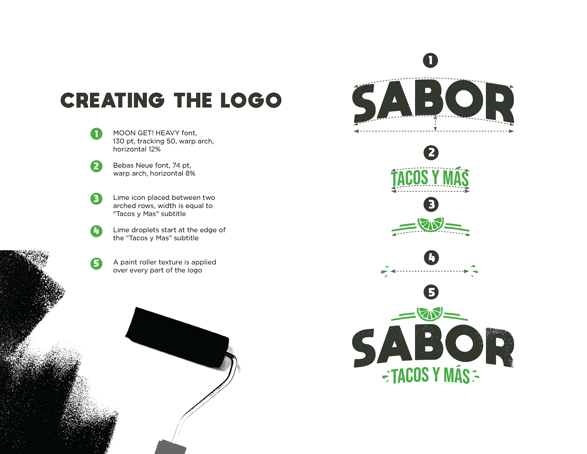
Once I had created and got approval for the branding with my team, some people were wondering, "why green?" Shouldn't restaurants use red, orange, or yellow? However, we felt strongly, that the lime, as an image and evocation of freshness was important to the overall aesthetic.
Finally, the green color became just as functional as it was conceptual, for one simple reason. The food location next door was none other...than Chick-Fil-A. So in the end, Sabor was a strong, eye-catching counterpoint for patrons who wanted a Chick-Fil-A alternative. It couldn't have stood apart more!